Carving A Clearer Path
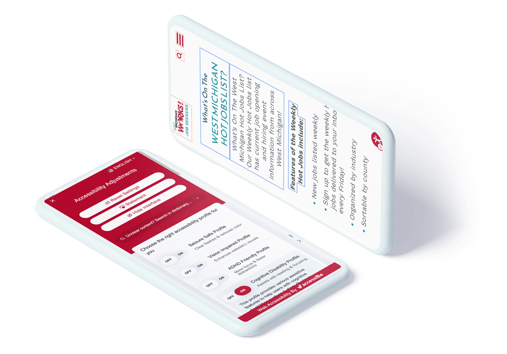
After discovering how to better architect the information to suit real users, we went to work on constructing a clean design emphasizing accessibility. Between the color coding, the addition of clickable buttons, and a clear UX language to guide users through the website, we laid a solid foundation to begin the new build.
Color Coded Separation
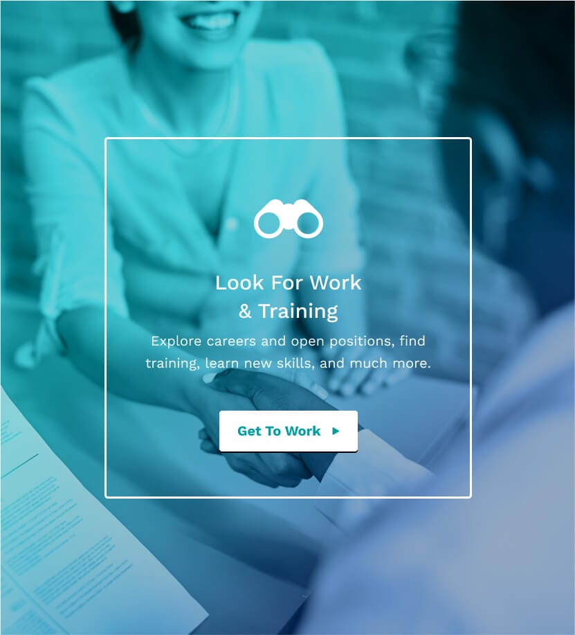
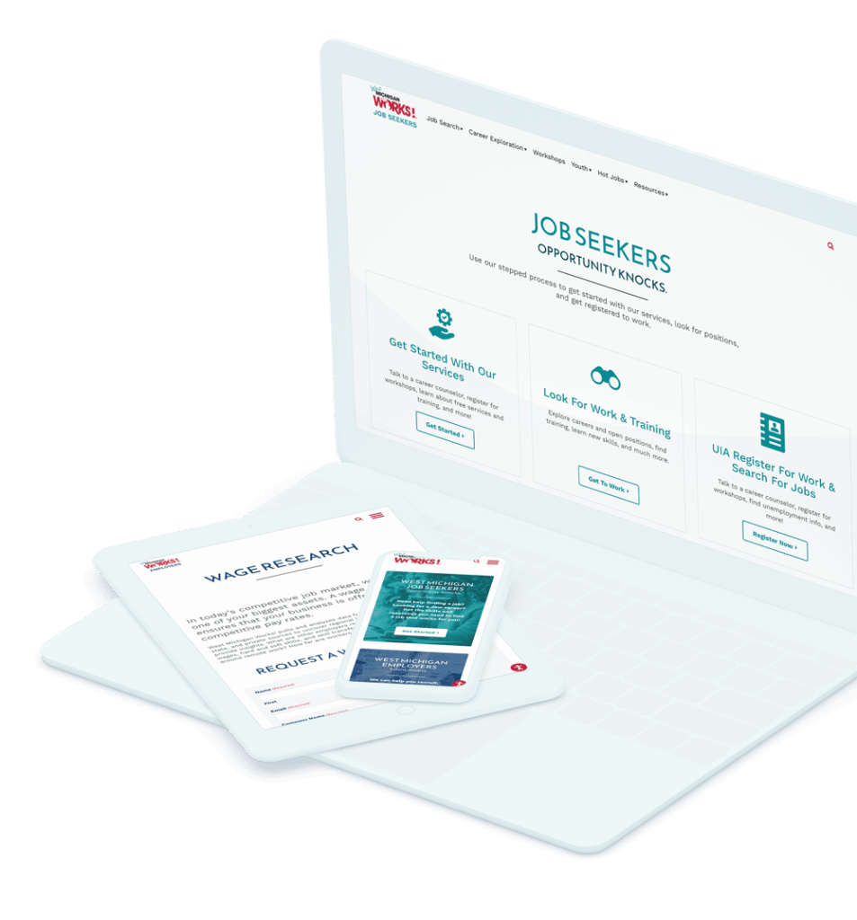
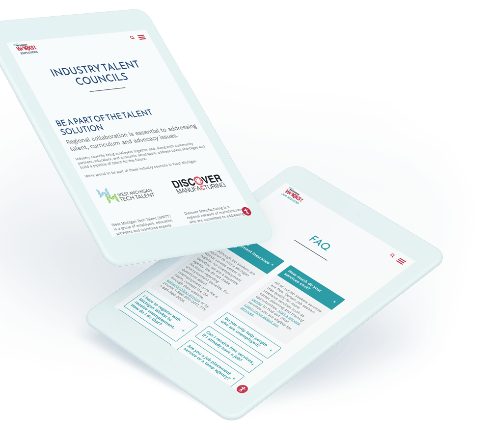
The information between the different areas is hyper-specific to the employer and job seeker user groups. For the most direct browsing experience, we created alternate logos for each side of the site and carried over their color-coded UI, so there is no question of where you’re on the website.
Multi-Site Consolidation
With the solidified design, we went to work consolidating the multisite. Using one centralized domain makes all information simpler to find, search, and manage. To maintain a clear division in the service areas, we added color coding to the website with alternate navigations and logos to emphasize where you are: in the brand parent, employers, or job seekers area.