Skip To Content

Let's Brainstorm!

Work With Us

Conveyor Components Company

A Rugged Conveyor Product Line Keeping Things Moving

An accessible website for a complex, industrial product mix powered by a dynamic design, keeping users interested and engaged.

Let’s Get Rolling

We started working with Conveyor Components Company (CCC) in 2018. Historically, they wanted to sell their products online but ran into too many challenges. When they were finally ready to make the jump to eCommerce, they didn’t want just any rebuild — they wanted this done right.

Their drive for a robust website resulted in conducting thorough UX research, allowing us to collect data that gave us a complete understanding of how users navigated the website and where they hit roadblocks.

Fueled by these findings, we designed the website to capture the movement of the products CCC sells: conveyor parts. Instilling a sense of dynamism throughout the website, we used diagonal motifs in the buttons, navigation, and other graphic elements. 
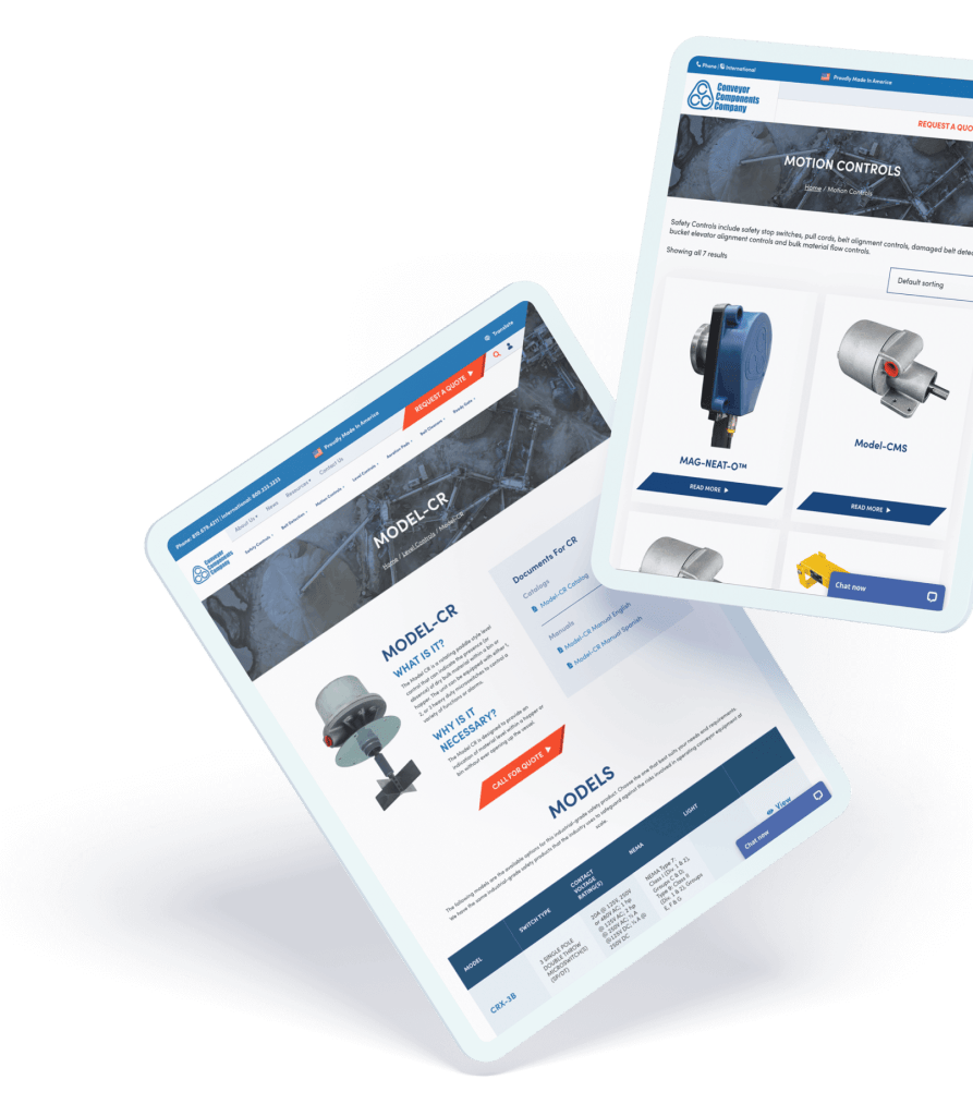
Conveyor Components Company website tablet mockups of the motion controls and Model-CR products.
  • Increase in views per user

  • Increase in average engagement time

  • Increase in engagement rate

Sun with squiggly lines
Orange scribble line across white background
Blue shape

Their team spends a significant amount of time with us and gives us ideas. They’re helpful and do what they’re supposed to do. I would certainly recommend them.

Mikel Faulk, Creative Director

Drafting the Diagram

Inspired by their aesthetics and movement, we architected the complicated product mix. We tied the parent models and child products together in a way that is both easy to browse and intuitive on the backend. This was achieved by creating one-to-many relationships, with the parent model having many associated products (think of a massive family tree). 

We took extra care in bringing the product structure into WooCommerce from Drupal. Multiple custom import methods were built to address each data type in various waves to ensure everything was included in the transfer process.

All child products were very similar with only minor differences. We wanted to use the most logical display of this information, so the user could select the right product without confusion. We rolled out product tables displaying the specifications to quickly compare and contrast to find the right item.


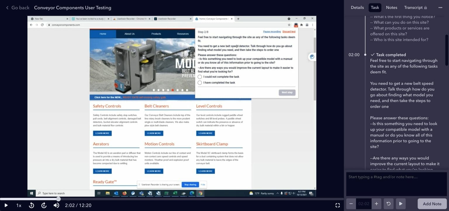
UX/UI findings, showing the steps users took throughout the website, for Conveyor Components Company old website that allowed Perfect Afternoon to craft a strategic plan for their new website build.

UX Research

We began with thorough UX analysis using heat mapping, website recordings, curated user tests, and surveys that looked to glean real feedback from actual users. 

This data allowed for incredible insight into the inner workings of the users of CCC on how to improve navigation, page layouts, and other nuanced interactions.

Dynamic Design

Pushing the design constraints to stand out from the competition, we used dynamic angles, engaging card hovers, and oversized product images.

Model & Accessory Tables

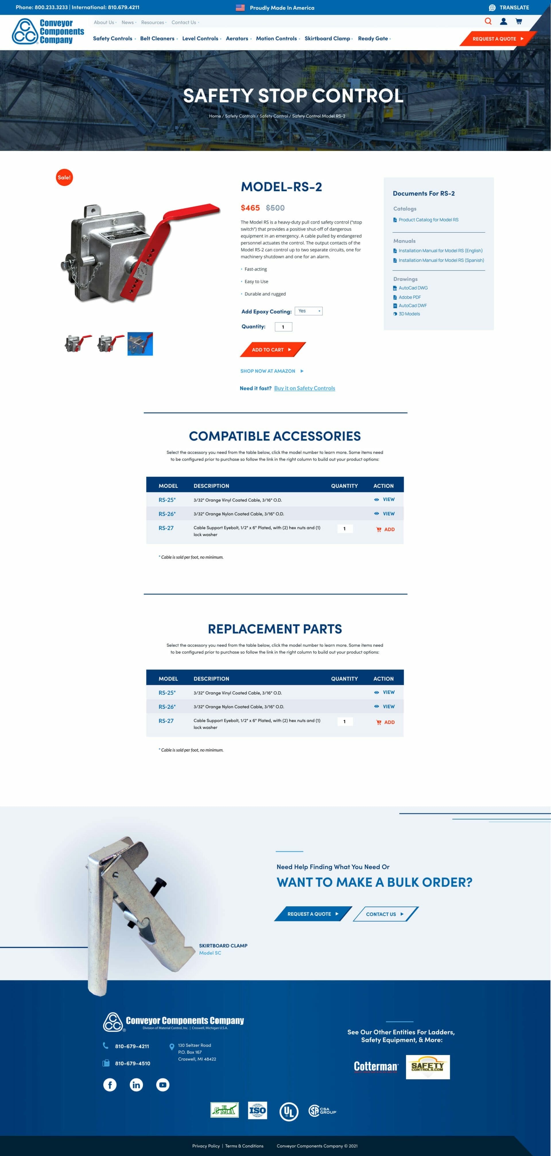
We constructed product tables for users to quickly identify the right specifications for their machine and get to the right product faster.

Updated Product Layout

Each model and product has various documents and drawings on their respective page, making them quickly accessible for users. This insight was a result of the findings from our UX/UI analysis.

Conveyor Components Company website page of the Safety Stop Control product page for Model-RS-2.
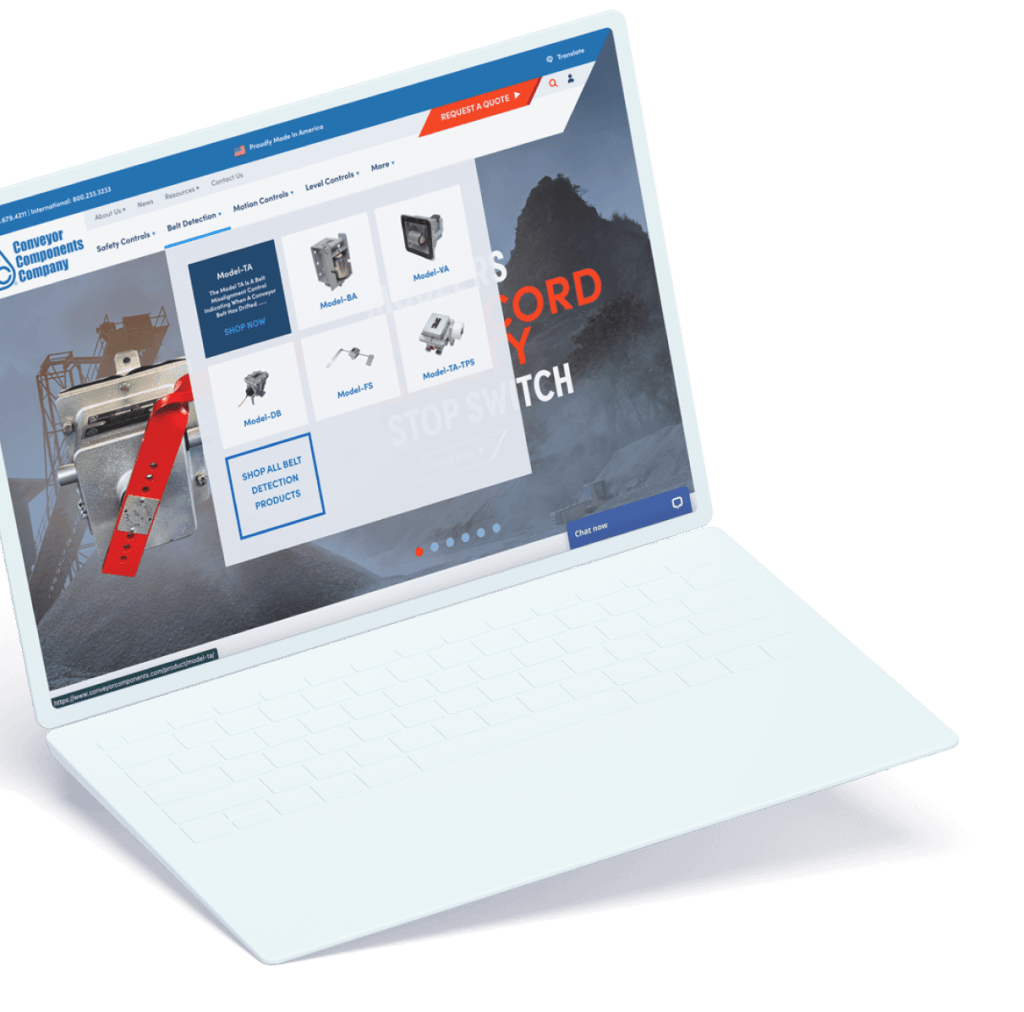
Conveyor Components Company website laptop mockups of the belt detection products in the menu menu.

Upgraded Functionality

Mega Menu

We included a visual mega menu for users to quickly select what they need using an image to trigger a quicker decision. It also reveals further information to help users feel confident in their choice.

Robust Search

With another finding from our UX/UI analysis, we updated the search functionality to be more user-friendly and easier to find.

Integrated Chat

Lastly, we added a chatbot, allowing users to reach out directly with any questions. This makes CCC feel super accessible and removes friction in reaching out.

Roll Out

With CCC on the right track, users and customers can now navigate a new, more logical website and product architecture. Finding relevant documentation and supporting accessories or models is now easier than ever!