What’s UX?
Every website should strive to provide an optimal user experience. Your users are the reason you have a site, to begin with, so you want to make sure they enjoy using it and the overall UX process. Every site has obstacles that impede the user’s ability to complete a goal or task. We can guess what they are, but it is ultimately a guess without data and evidence. This is why thorough research into the user experience is essential to a holistic understanding of your site.
To start, we must first understand what the UX process is. UX stands for user experience, where we look to understand how users interact and use the surrounding systems; the process is to analyze the steps taken to perform that interaction. With this as our groundwork, we built a series of tests and ways to analyze, quantify, and get a deeper understanding of the user’s needs.
Depending on the test subject, this can be somewhat abstract. Quantifying a motivation or feeling can be hard, so we use various tools to assess the experience from multiple angles. This offers us a holistic view of user obstacles and their journey to meet their goals. Mixing intuitive observations, data analytics, and direct feedback from users, we can surmise the right direction to take their website in to maximize ease of use.

Our user experience process
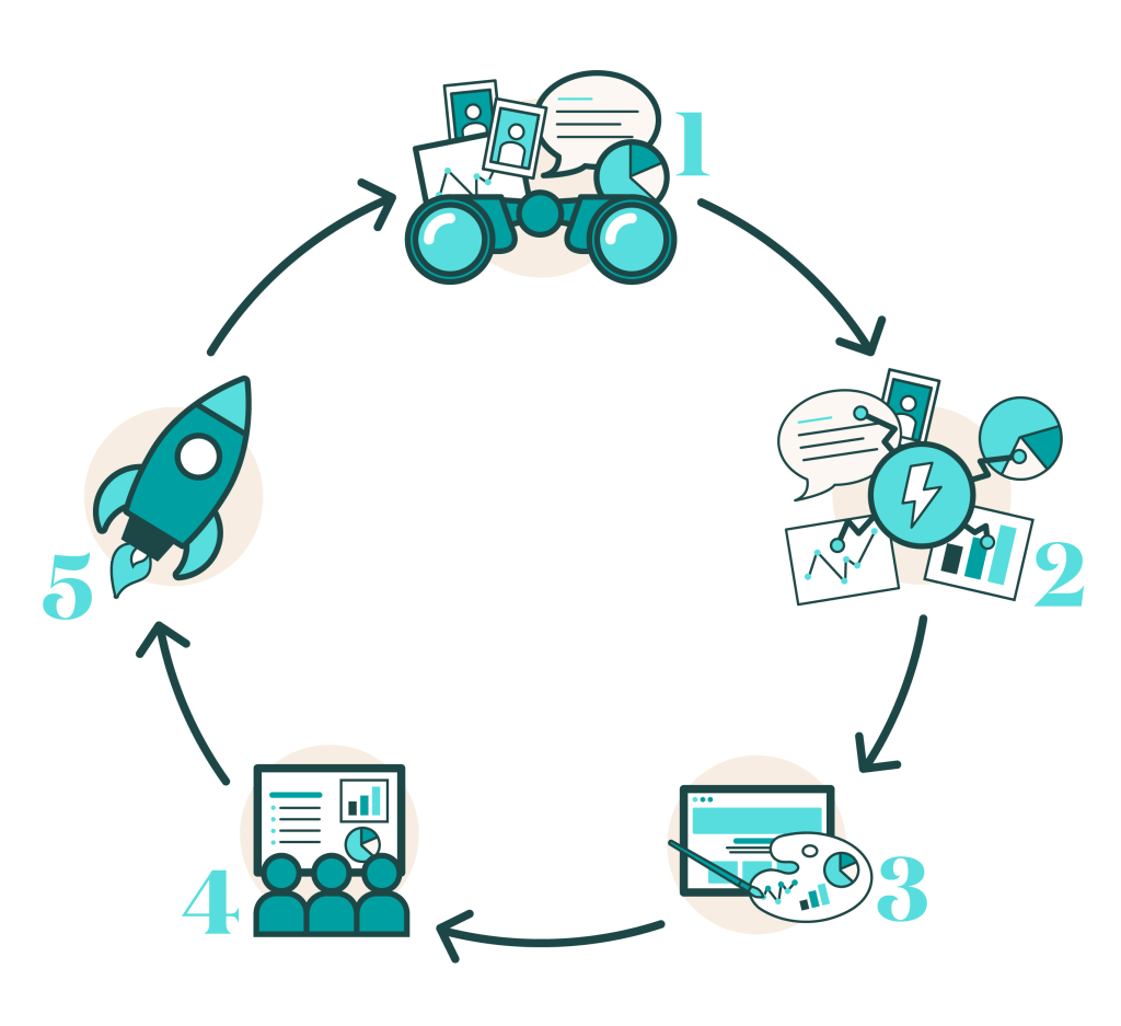
We recommend an iterative process that continues to build upon itself, improving more and more the longer you engage with a UX maintenance cycle. Our standard pre-rebuild process is as follows and enforces logical steps to gather all the vital user feedback needed.
- Collect: We will work on collecting information on current user behavior using heatmaps, screen recordings, and curated user testing.
- Evaluate: Our team will evaluate all the data collected and use it to generate a list of improvements to alleviate user issues.
- Design: We will conceptualize the new design’s look and feel and craft the agreed-upon page layouts using the improvements.
- Present: Upon completing our work, we will present the new design to you in person and walk you through what we created and why.
- Implement: We will decide together what items to implement and work with our development team to make what we presented a web reality.
UX from a high-level
First, we like to take a high-level view of how users interact with the site. This includes evaluating top pages, the order in which users browse the site, how they’re browsing it (i.e., their web browser and device type), and more. A bird’s eye view of the site usage allows us to better understand the initial behavior and desires of the user base before digging too far into the more personal aspects of testing.
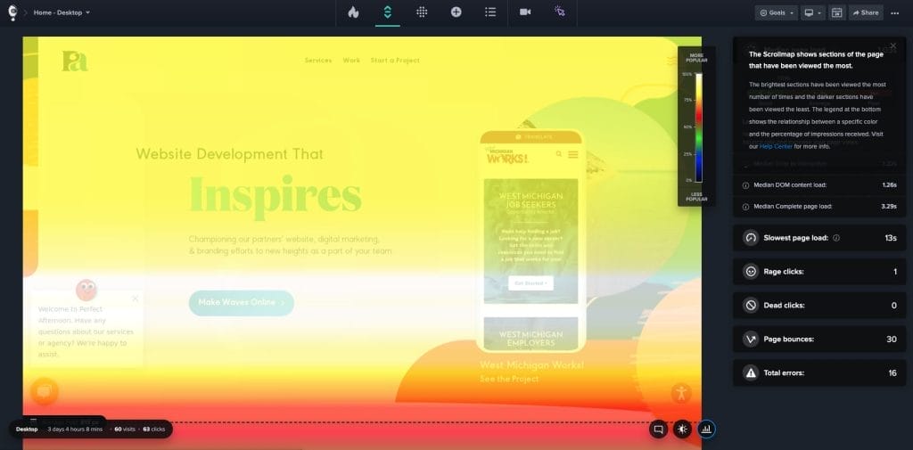
From our zoomed-out view, we move further to look at individual use via Heatmaps. These graphics display a heat index correlating with clicks and interactions on a webpage. Using these, we can see where users anticipate an interaction and where the most popular navigation points are. These are used in conjunction with other data sources to maximize their impact.

To get a little closer
Now that we understand how the numbers support the use cases on the website, we closely examine how users use the site via recordings. This handy tool allows us to look at anonymous user activity for the whole period they browse the site. We watch many of these recordings to look for patterns in user behavior that express frustration or confusion. No audio is included, so we use our experience and understanding to infer an intention for the user based on what they interact with.
These can hold a wealth of information that provides excellent insight into how users get around the site. When talking to our partners, they have their own perceived notions of how users may get around the site, as do we. This gives us an unbiased view of how they navigate, and the reality can contradict our expectations.
Finally, face-to-face
Throughout this process, after we interface with our partners to identify their goals, we formulate tasks and questions for mock users to perform. This is called curated user testing. We encourage our partners to bring their own users from their customer base so the test can be as realistic as possible. Additionally, we can test a pool of blind users to have a truly new user on the site.
The software we use to facilitate this process gives the users the tasks as they work through the test while recording their screen and audio. We request they speak out loud to gain insight into their thought process without inferring anything. The direct feedback we get from users is immensely helpful in confirming perceived pain points and identifying ones we may have never seen.
Bringing the UX process all together
With all our tests performed and data collected, we build a report that ties it together nicely. We can take a holistic look at our feedback and identify ways to fix the obstacles we uncovered. These can range significantly from vast redesigns to minor updates in UX text to more deliberately guide the user.
Once we finalize our thoughts and conclusions, we discuss them with our partner. This will often confirm existing concerns or illuminate areas of issue that weren’t even considered. With our agreed-upon list of improvements, we take our knowledge and move into the design phase with a clear direction to make the site easy to use and intuitive.
Are you ready to start making regular usability improvements on your site? Or maybe you are ready to know your users on a deeper level?
Let’s chat! We would love to help you optimize your site experience!
