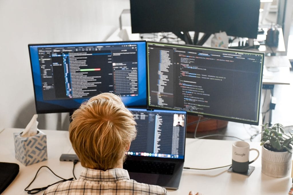
Web Design Industry Trends
With every passing day, what’s in style is always changing and evolving, often building off yesterday’s trends. Perfect Afternoon wants to take a look at the web design industry trends we’re seeing to keep you up-to-date and hopefully get you inspired to create! In this two-part blog series, we’re going to talk about our favorite trends we’ve seen out in the wild world of the web!
Neumorphism
Think photorealistic painting meets web design. This new trend, which seems to be discussed more than it is implemented, is the concept of making everything look as if it’s been extruded and vacuum-formed from plastic. It makes the user interface feel as if it’s lifted from the screen and is a tangible object you could reach out and touch.
The look is achieved through the use of precise drop shadows and highlights, taking a chance to dramatize corners and inset containers. The effect is impactful and unique, albeit not very accessible to people who have vision problems and use accessibility software.
The dialogue surrounding this has been very interesting because, at this point, it’s highly conceptual and not being used widely, apart from a few sites pictured. However, there are rumors Neumorphism will make an appearance in an upcoming major iOS update. Since we know Apple is a tech trendsetter, many will likely follow suit.
Emotional, Flat Illustrations in Place of a Hero Image
We can all agree the big hero image taking up most of the viewport on page load is on its way out. We’ve seen this as a mainstay for many years, and it’s starting to feel very standard and bland. We’re always trying to push our designs so the site can feel fresh and interesting for users. While the video banner is fresher, the standard image rotator has gotten TIRED.
So, we’ve seen a shift towards more graphically driven illustrations, typically in a flat vector style to encapsulate the brand. From the choice of illustration style to the quality of line, this visual should wrap up your brand in a simplistic, enticing, and cohesive piece. It’s a way of getting the user into the meat of the page more quickly by pushing more content above the fold and giving a meaningful introduction without having to say much.
HotJar takes the opportunity to showcase their bright color palette and give a quick look at the people who might be using their software to immediately connect to their potential audience. Dribble takes it a step further showcasing work from their platform, which also acts as a great visual metaphor for the depth of content and exploration possible when browsing.
Appeals to Empathy
As we have seen in several large-scale ad campaigns (including Planter’s ad in which they kill off Mr. Peanut and he is reborn in a later ad as a baby nut; Apple’s long-format ad of 2 young girls making a slideshow about their deceased grandmother for their grandfather; Google’s ad about Alzheimer’s and Dementia), there is an emotional attempt to create a subliminal fondness of the brand while increasing people’s memory instead of promoting the product itself.
Even in our current political dialogue, emotional/moral language is being used more and more because it’s working. Politicians who work purely off of numbers can come off as unenticing and boring to many. We are living in a very emotional time, where brands of all kinds are looking to integrate themselves further into our everyday lives. Humans are emotional creatures and tend to feel very deeply, developing strong biases for things they agree with and greet opposing views with animosity. We can see as the brands listed above take advantage of that and work to inspire an emotional connection to them.
This is no different in website design. To win people over, it is easier to do so by evoking a sense of empathy where people feel as though they’re part of it all and invested in the brand, even if they’re not making an outright purchase at that moment.
You have two adorable, young boys working together using a device with the Apple logo pinned to their chests. They look like they are learning and working together, which is sometimes difficult for children to do. This is a connection Apple is building to you, the consumer, without even highlighting their product – notice you cannot actually see the product in the photo.
But, Who Needs Trends?
It’s always good to keep up with fresh trends in the design world to have an understanding of what brands and competitors are doing. It’s important to be aware and to keep up to the baseline of modernity – having a full-width navigation bar was once a new trend, but now it is a baseline element your site should have to look like it’s from the last two decades. Remember though, use these web design industry trends in moderation and always with your brand and business in mind.
Contact us today to get the best web design industry trends, tips, and tricks to stay up-to-date!
Primary Image Source: Envato Elements

