Top Design Trends
Welcome back to our series on the top web design trends! We hope you enjoyed the first segment and are ready for more insights. With even more hot trends to explore, we’ve found quite a bit of inspiration from them, and we hope you do, too!
Function over form
While this may be more of a newer mainstay rather than a trend, we have noticed the push first to make things user-friendly and intuitive and then visually pleasing. As designers, it’s often hard to detach yourself from trying to make something purely visually stunning. Through years of designing, whether in school or self-taught, we learn many rules and guidelines to make projects look better, such as the principles of design and Gestalt Theory.
While exploring these techniques makes us better designers, it may not always make sense to the user. Some decisions may seem to hinder their experience rather than enhance it in our quest for visual enlightenment. This can be seen in anything from unreadable text to nesting certain elements that should be visible or overloading the viewport with too many options. As a web development and design agency, we must put the user experience first and aesthetics second to have the most success with designs.
3D integrations
As the web advances, so do the things that can be done! We have noticed that as we shift big banner hero images out of top design trends, brands are beginning to utilize 3D models instead. In many cases, they are also interactive, responding to mouse movements, scrolls, and clicks.
This is a big wow factor in many cases since most users expect the web to be 2D. It is also very memorable for users to warrant a bookmark or be a trigger to show their friends. It tends to be purely decorative. However, when there is a functional use, people stop and admire all the thought, work, and planning required.
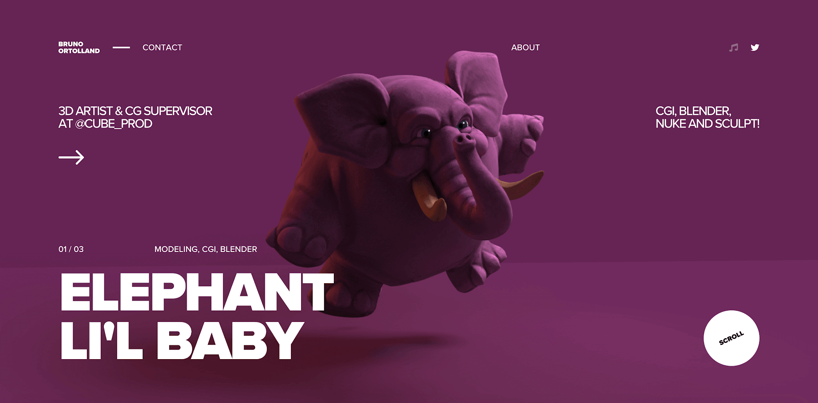
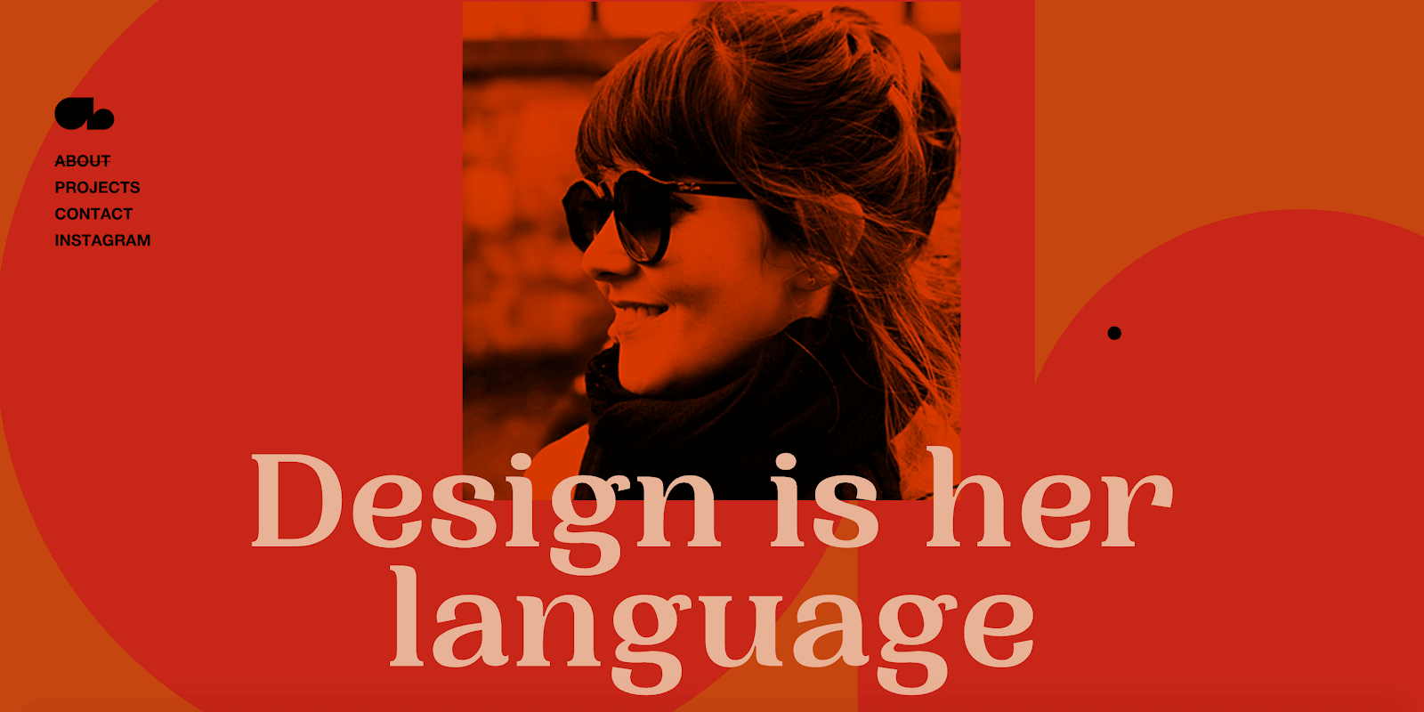
This is an example of a portfolio site that uses awesome 3D models to show the designer’s expertise. Functionally, it is not integral to using the site itself.
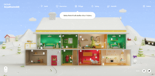
This site allows you to navigate the home, looking at the different smart devices. It gives you the feeling this could be your home since you can view the different rooms.
Amorphous, undulating forms
With the web becoming more flexible, it seems our vector design is, too. In many applications, irregular, organic forms are background elements to ground illustrations and images. This makes the environment feel much more freeform and creative. They are often utilized in tandem with negative space to balance out the frame and give them enough authority to command attention. This can also be seen in the Dribbble example, even though a great deal of depth is worked into that design specifically.
The Violetta site uses light animation to subtly change the form’s shape to make it seem even more organic and inspire more visual interest as you scroll. With a grey background color, the shape also takes on a secondary position, giving the image even more prominence.
The UnDraw library, a popular free illustration library, uses shapes as the background of many illustrations. Despite being very flat, they also retain much freedom and movement due to these organic shapes that are a motif throughout the library.
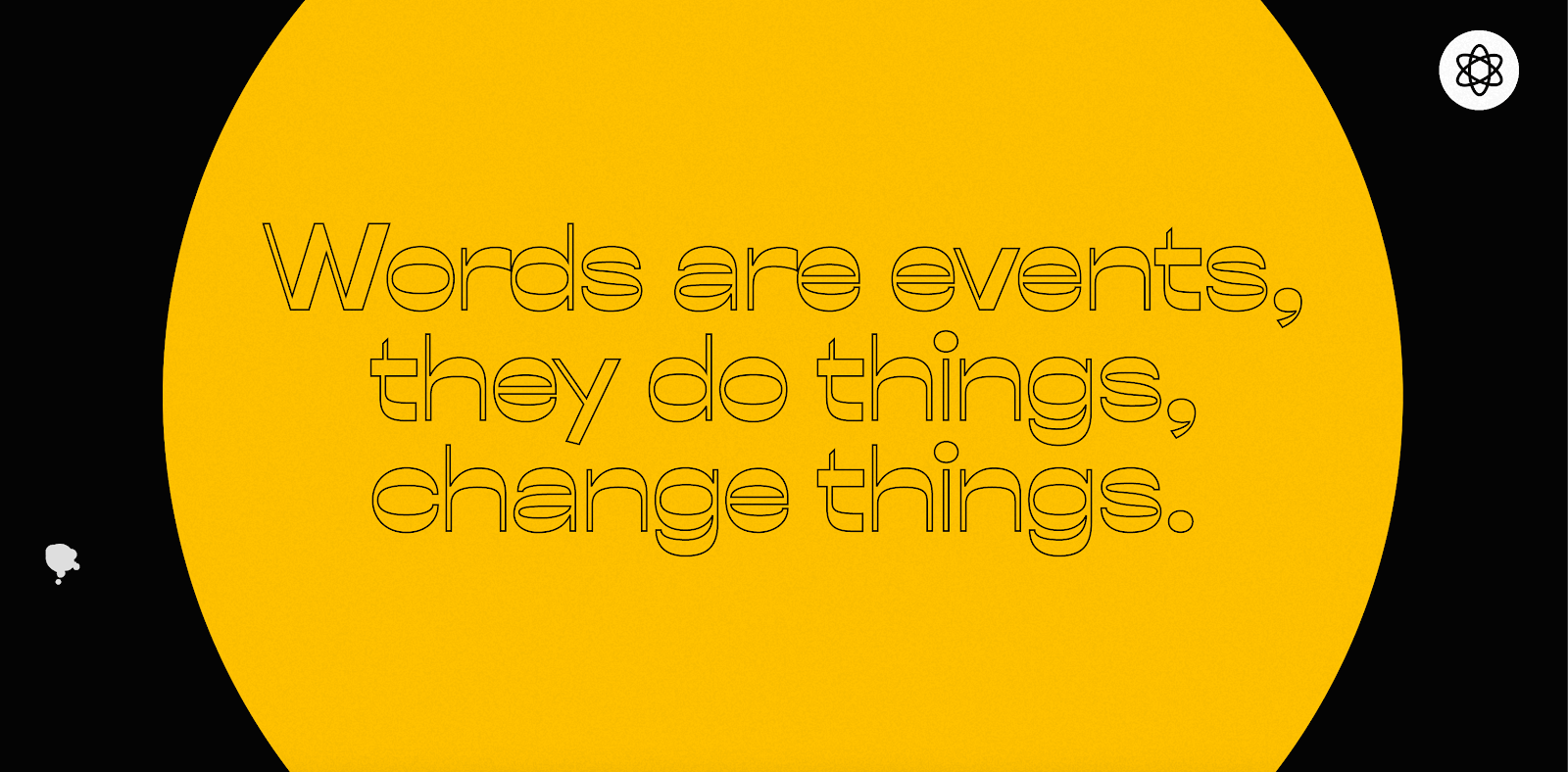
Type as the focal point
In a different kind of effort to mitigate the blandness of the standard hero image banner, greater emphasis has been placed on type. This is usually integrated into the main image, merging into one impactful statement.
However, it is not limited to the banner; many designers are taking the initiative to weave instances of oversized text throughout the entire page flow. This makes large statements throughout the experience and helps to drive home individual points. You can use this design motif to continue reinforcing your primary point.
It also brings a “high design” presence, where grids are heavily utilized to create unique but intentional layouts. This makes your font choice an important element in your design since it appears on such a large scale. You can notice all the small details in the type of anatomy. So note that if you’re using serifs, inspect the font in depth before onboarding it into the design.
The website as an environment all its own
This is especially evident in the high-end award, cutting-edge tier sites. You are fully immersed in what you are looking at. Everything is set into one background, and you traverse it as you would a landscape. While visually stunning, these websites are not always as functional as you want. That makes them a much better fit for something exploratory and informative, to prove a single point or all on one page. However, you create a memorable moment in the user’s mind, which is more likely to be remembered by them.
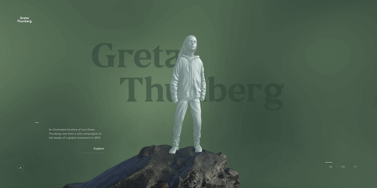
This piece celebrates Greta Thunberg’s nomination for Time’s Person of the Year. A 3D model is at the center, and all the content swirls around it, spinning and zooming as you scroll. This is highly immersive.
Sound plays throughout the experience to immerse you in the environment, especially with headphones on. You are placed in a moment in time to appreciate this site, which is why it is so impactful.
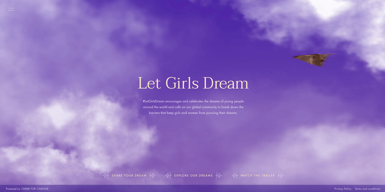
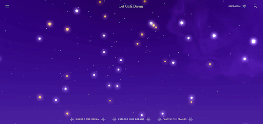
In this Let Girls Dream site, users are thrown into a dreamscape to explore the possibilities of the realm. Fully immersed in a purple sky as you navigate the site, users feel inspired as they explore women’s dreams worldwide.
Dark mode
As the World Wide Web integrates further into our living worlds, our eyes become strained when staring into the intense blue light of a computer screen for a full workday. We also spend hours at home watching TV, scrolling through social media, playing games, etc.
In an effort to give people a bit of a break, we have seen the rise of dark mode. This is a full tonal shift from something bright to something not as visually straining. Apps of all kinds have a direct integration for dark mode — Reddit, Twitter, and Instagram have recently jumped onto this trend. Now, we are seeing plugins being made for Chrome that convert every website you visit into dark mode, even if that website’s author has not provided the option.
Top design trends: Ready to incorporate them into your website?
At the end of the trend, whether it has months or years of longevity, it will look dated (think heavily graduated buttons and gratuitous drop shadows). Just like in home decor, where succulents and Aztec blankets scream the 2010s, you can identify if a site is older by whether the navigation bar spans the entire width of the screen.
While there are certain trends you should be aware of, like putting UX above aesthetic in terms of design, these are a more subversive form of a trend that almost crosses over into best practices. However, something like Neumorphism will be a very easy signifier of when that site or app was created.
Furthermore, it has to fit the brand. If you’re trying to force dark mode into the design theme of Gerber Brand Baby Food, for example, it may not be a good fit and will feel like an ill-suited trend. However, dark mode with a gaming brand would be a perfect fit.
Regardless, it’s always good to keep up with fresh trends in the design world to better understand what brands and competitors are doing and where your brand can fit in.
Contact us for the top design trends, tips, and tricks to stay up-to-date!
Photo Credit: Envato Elements
