What do you think of when you think of the color orange? Maybe the fruit, a basketball, or a sunset? You’ll often be hard-pressed to find something you associate with inherently negative orange. Although I am from Michigan, there are orange traffic cones and barrels that will elicit some anger, even those just meant to get your attention, so proceed with caution. Largely, the color psychology of orange is associated with happiness and attention. It is the second color in the rainbow and on the warm part of the color spectrum. It is a high-energy color that inspires movement and vivacity.
Color Psychology: The History of Orange
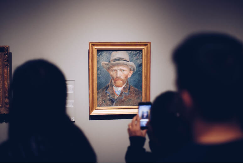
Throughout history, orange has been a core part of art and design. Looking to master artists like Van Gogh and Cezanne, using orange in artwork draws attention and creates depth since warm colors feel like they are rising into the foreground with cool colors receding. This allows you to use orange to construct thoughtful compositions that guide you through a painting spatially.
We can go back even further, thousands of years, to ancient Egypt. They used orange pigment in their hieroglyphic paintings on tomb walls, though the pigment couldn’t be recommended anymore as it was highly toxic. Similarly, it was a popular color choice in paintings, mosaics, and beyond (and also toxic) in ancient Rome. Throughout Asia as well, it holds a high level of significance religiously in Confucianism and Buddhism, being largely associated with spirituality.
It is a color of many names; the English-speaking world has adopted orange from the well-loved citrus. There are many variations of this when translated into other languages, but all root back to the name of the orange fruit. However, that name only came about relatively recently, being called yellow-red for many years before the 16th century. Saffron is also common, and it is named for the sprigs of the flower. It is still used in many places that practice Buddhism.
The psychology of orange
Orange is a color of high reverence in art and world religion. It holds a lot of visual sway when it comes to commanding the viewer’s eye and instilling energy in whatever it touches, and this hasn’t changed. When confronted with orange, the brain associates it with happiness, energy, attention, and caution.
There are many different variations of orange, ranging from red-orange to yellow-orange. When saturated on the redder side of its spectrum, orange elicits an inherent sense of comfort and attentiveness and a higher level of energy with a higher saturation on the yellower side. This allows for many choices in tones to elicit exactly the feeling you’re looking to elicit.
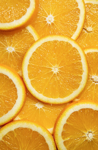
The bright color is seen all throughout nature in autumn forests, pumpkin patches, fruit groves, animals, and beyond. So while it may feel artificial, it is greatly present in the world around us. When we encounter oranges in nature, it is almost as if, by instinct, we pay attention to them. As we evolved to seek out risks, you will see some poisonous animals employ it as a way to caution those opportunistic eaters that may think it’s a good idea to prey on them, or in fruits that have evolved for high-visibility to be eaten and thus have their seeds spread. These deep color associations are hard-wired in us through evolution and are non-cultural roots of color psychology.
Through the evolution of our society as we know it, we have seen orange becoming almost synonymous with high energy and happiness. This reinforces the associations we already have in our own minds and allows them to proliferate through our culture of orange being high-energy, vibrant, and joyful. It is easy to do a quick test by holding an orange object in one hand and a blue (a calming color) object in the other and feeling the difference in effect the colors have on your own psyche.
The use of orange in branding
As brands always look for ways to stand out, one easy way is to employ a color that demands attention. If you’re in a space where your brand deals with excitement, activity, or citrus, orange is likely a great choice. It can help you stand out and bring customers happiness by looking at your brand materials, which is a great disposition to have associated with your company.
Brand examples
Nickelodeon
Nothing was more iconic on TV for all the 90s kids out there than the Nick Splat logo. It was a mainstay for many years, making it pop out against the competition and leaving a lasting impression. It immediately established the brand as high-energy and fun, bringing kids joy. Nickelodeon’s programming was also incredibly appropriate for the company that ran shows like Spongebob, Ren & Stimpy, and Jimmy Neutron, which tend to have a lot of fast-paced excitement.
Orangetheory
The fitness chain Orangetheory can be clearly seen driving by any strip mall. The sign alone commands attention, and when paired with the brand’s upbeat voice, it’s a fitness brand that stands out from the rest. Most people associate positively with it due to the branding alone, even having never taken a class there. They even use orange machinery and lighting in their interiors, further pushing that energy and taking advantage of color psychology to push people through a rigorous workout.
HubSpot

We couldn’t miss an opportunity to discuss how great HubSpot’s branding is (yes, we’re a partner, but I swear we’re not biased.) Their use of orange in their branding allows them to stand out from the crowd of logos within the CRM space, where many are blue, orange’s complementary color that strongly contrasts and demands attention. The use of orange is also a fabulous reflection of the company’s personality: happy, high-energy, and inspiring delight in their users. This allows for the color also used to feel incredibly authentic to the company rather than a ploy to stand out in their field.
Orange you glad I didn’t say banana?
The color orange is known to be very polarizing; when you ask a given person how they feel about it, they tend to either love it or hate it. This can be said for many things with a strong personality, whether people, brands, or in this case, even colors. Regardless, it is a color that demands attention, inspires joy, and gives people vigor. It is a great choice, too, for your brand if it speaks truth to your company’s personality.
Let us know where you fall on the spectrum of loving or hating orange and if you need help deciding your brand’s color.
Images Sources & Credits:
Maxime Lebrun on Unsplash.