What is a Brand Palette?
Your branding palette is the set of colors that express your brand’s personality to the world. Color plays a huge role in creating an identifiable brand, seeing even licensed Pantone swatches like Tiffany Blue or Minion Yellow that were crafted specifically to capture those iconic colors. Even glancing at these swatches will make you immediately associate them with the brand, and that level of recognition speaks to the one anchoring brand color.
Thinking further into palettes, companies like McDonald’s, with their use of red and gold, immediately trigger brand recognition, even if the colors are seen in another industry entirely. John Deere goes so far as to trademark the combined use of green and yellow on machinery. This is how much influence a brand palette can have, making your business immediately recognizable without using your logo.
These are examples of larger companies with global influence. However, owning an iconic color palette still applies to your brand, no matter the size of your business. Even on a local level, you can likely think of a restaurant or other entity that does a lot of advertising tied to color so that you know immediately what the brand is before looking at the logo.
A strong color palette is vital to creating brand recognition at scale, and we’re here to help you figure out where to start. Beyond that, it sets an overall feel for your brand to inspire energy, put the viewer at ease, or evoke whatever emotion you want to tie to your brand experience.
Identify the feeling you want your brand to evoke
Looking at different colors evokes feelings; we’ve all heard this in our high school English classes. Was the blue drape a symbol of languid sadness, or was it just blue? The answer can be a little of both. Color psychology is a very interesting field of study; it tells us that color can elicit a subconscious emotional response in the viewer, which can be used to your advantage.
What anchor color is right for your brand?
Depending on your industry, different emotions might be more desirable to inspire. High-energy workout company? Try orange. Trustworthy financial institution? Consider blue. The more you think about it, the more you notice consistent color use within many brands in a given market space. This is because that color is likely to elicit the desired emotion. Think of the healthcare space: Many organizations use blue for its trustworthy, calming effect.
Choosing an anchor color in your palette makes defining the rest much easier. Your anchor color acts as the primary color in the palette, and the rest of the colors can be informed by it. Like, when thinking again of a brand like John Deere, where they do have 2 dominant brand colors, the green is ultimately what they’re known best for, and the yellow works to support it.
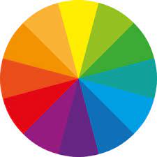
Below is a list of commonly associated colors and feelings, though there is much room for interpretation in these definitions. Think of these as a general jumping-off point:
- Red: Power, Excitement, Love, Speed, Anger, Lust
- Orange: Energy, Excitement, Friendly
- Yellow: Happiness, Competent, Positive
- Green: Health, Money, Environmentally-Friendly, Loyal
- Blue: Corporate, Reliable, Competent, Sophisticated, Trustworthy, Health
- Purple: Luxury, Power, Unique
The above colors are the common core of the rainbow, and they have so many variations in hue, tonality, and beyond, but this generalized list can give you a good place to start. Of course, many more neutral colors and variations of browns and greys can act as the primary colors; however, they are slightly less common.
Consider which scheme is right for your brand
Now that you know what color is right for you, your color scheme can similarly have a psychological effect and give you a tool belt, so to speak, for your designer. A color scheme is a set of colors that relate to one another. Many schemes can get quite complicated once you start looking at the more advanced schemes in color theory. We’re going to look to start with the basic ones:
Monochromatic
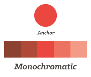
This color scheme uses a single color in various tints, shades, and tones to create a range of colors that all use the base hue from your anchor. This color scheme tends to feel very clean and professional. While some think it may be monotonous, you can achieve great things with it if utilized properly. If you like your anchor color and are finding it difficult to find other accents to bring in, you might not need to.
Analogous
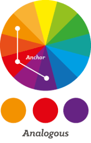
This scheme uses the neighboring color(s) on the color wheel, so if we were to use red, the other colors in your scheme would be orange and purple, or just one of them. Analogous schemes have a harmonious feel that flows naturally since you’re largely working within a family of similar color that still has a good deal of contrast.
Complementary
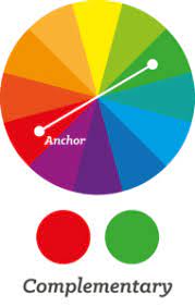
This is created by using your anchor’s opposite color on the wheel, so if we were using blue, we would use orange as the complementary color. Christmas colors are complementary, so they are vibrant and pop when placed next to each other. If you require CTAs that jump off the page or a more energetic vibe for your brand, then a complementary color scheme may be right.
Triadic
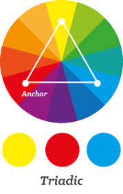
Create an isosceles triangle on the wheel with one point on your anchor color, and use the other two points to select the supporting colors. This is commonly seen in a primary scheme using red, blue, and yellow. This scheme helps to create balance and stability in the branding, created on strong foundations, yet it still has a lot of visual variance, which can also give it an energetic feel.
Have fun with it
Choosing your colors isn’t an exact science; while we can use schemes and psychology to fuel our decisions, ultimately, it’s your choice to choose what makes the most sense. Maybe you like the complementary scheme but don’t like how orange works with blue as much as you like yellow.
Go with your gut (or your designer’s). Who knows, the scheme you tweaked may now be an advanced split complementary without even knowing it. Working with color has a certain rhythm, so you have to find the one that rings true to your brand.